
Celebrating 20 years in business is a major milestone - and for Bluebox Software, it marked the perfect moment to pause, reflect and look ahead.
Based in Worcester, Bluebox Software engaged The Creative Hut to explore the possibility of a brand refresh that would honour their legacy while creating clarity, confidence and consistency for the future. Over the years, the brand had evolved organically, resulting in multiple logos and visual styles that no longer clearly communicated who they were or what they stood for.
This project became about alignment - bringing people, purpose and presentation together under one clear, confident brand.
OUR APPROACH
To truly understand Bluebox Software, we knew we had to start at the core.
We began with a Brand Discovery Workshop, bringing together the senior management team for a deep dive into the business. This collaborative session explored vision, culture, values, audience, competitors and long-term ambition - creating a shared understanding and a strong foundation for everything that followed.
It quickly became clear this wasn’t just a refresh - it was a full rebrand.
Together, we:
Defined the core target audience
Established a clear, confident tone of voice
Reviewed competitors and market positioning
Identified the values and personality the brand needed to express
From there, we moved into concept development - translating insight into creative direction.
Creating a Brand That Stands Out
A key goal was to move away from “typical” software branding.
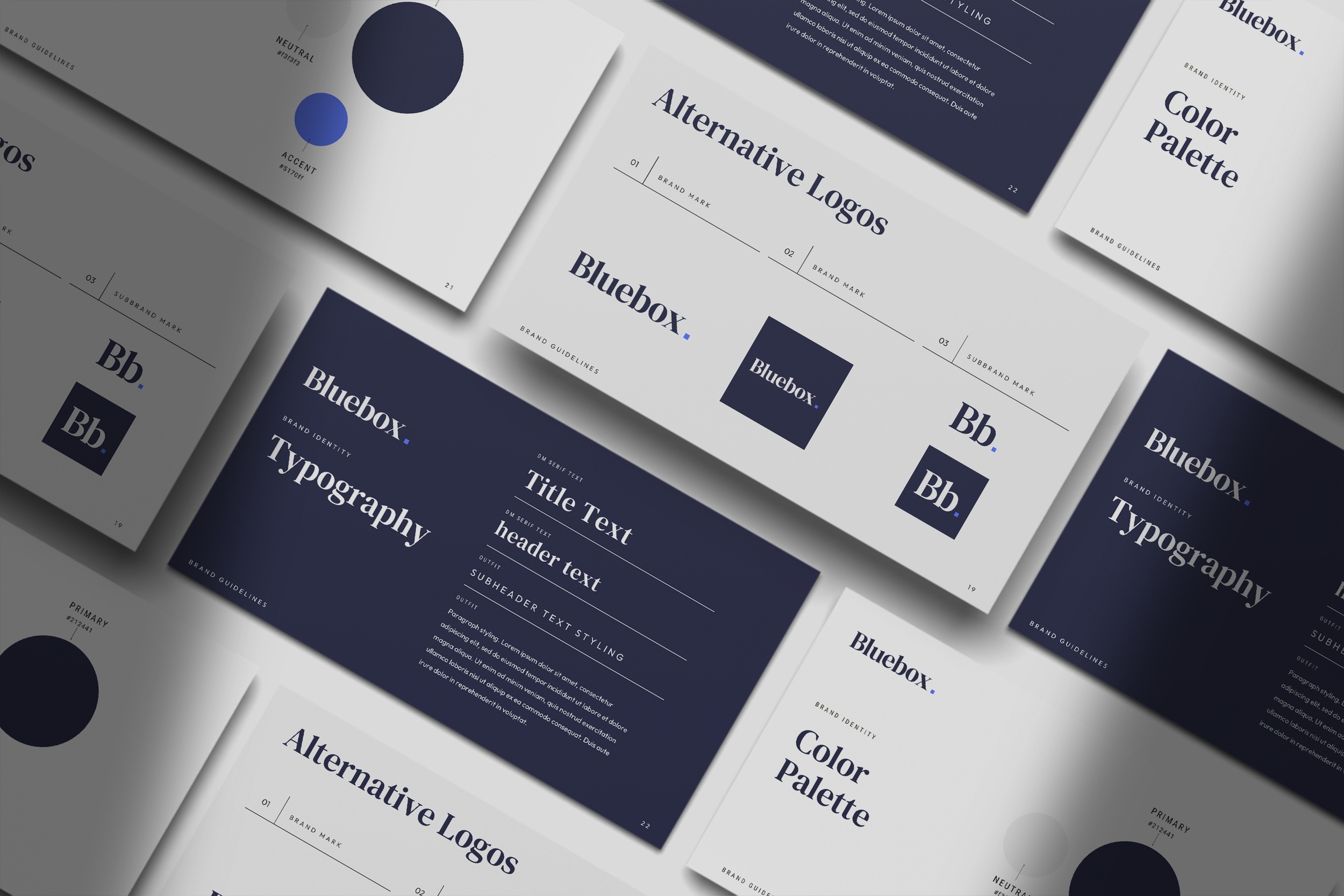
Typography, colour palette and the brand mark were all carefully considered to ensure the identity felt distinctive, contemporary and confident - while still being professional and credible. Over several weeks, we developed and refined concepts, working closely with the Bluebox team until the final identity felt exactly right.
The result was a visual and verbal brand that clearly communicates who Bluebox Software are - and sets them apart in a competitive space.
The Result
The new brand gave Bluebox Software clarity, consistency and renewed confidence.
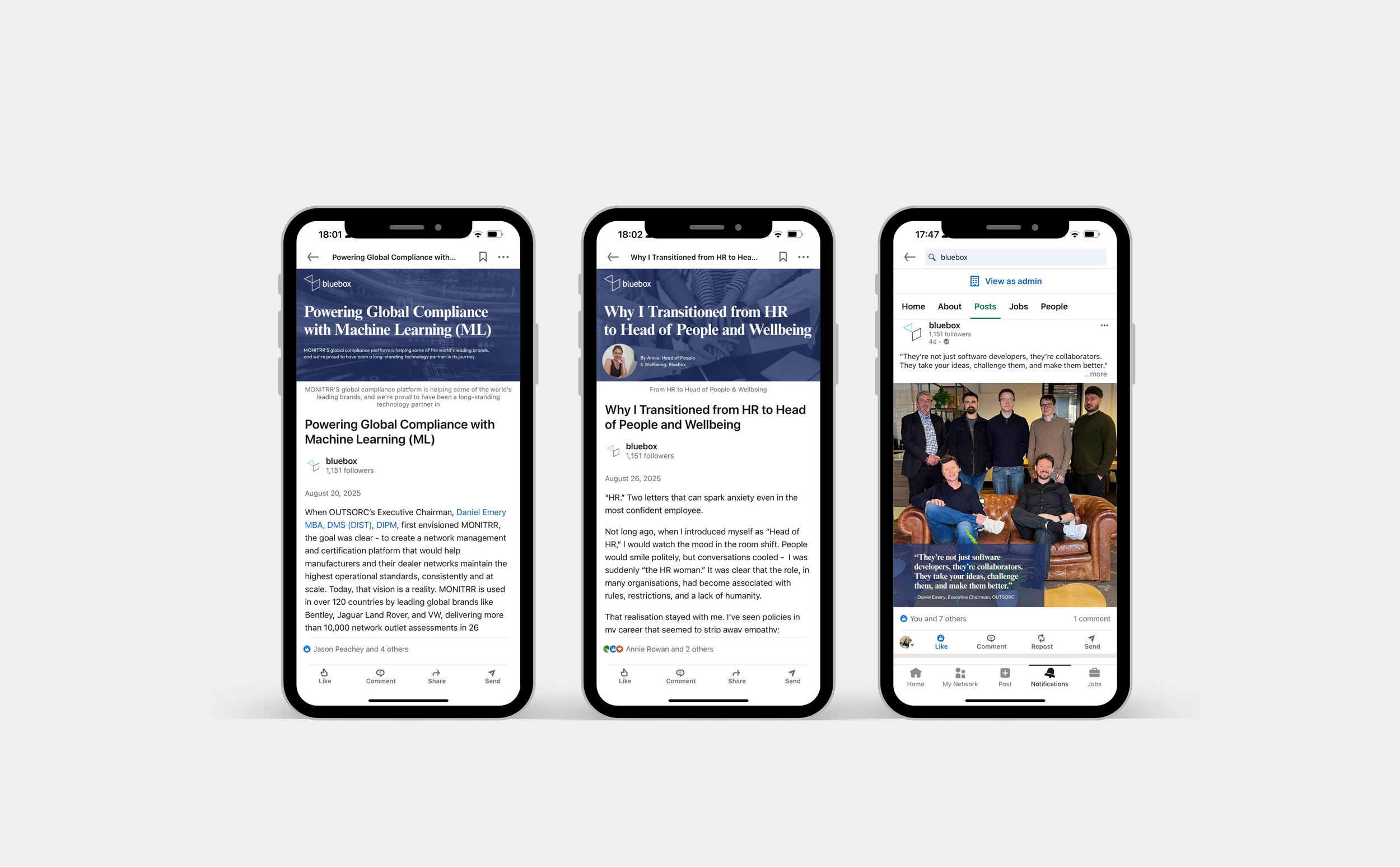
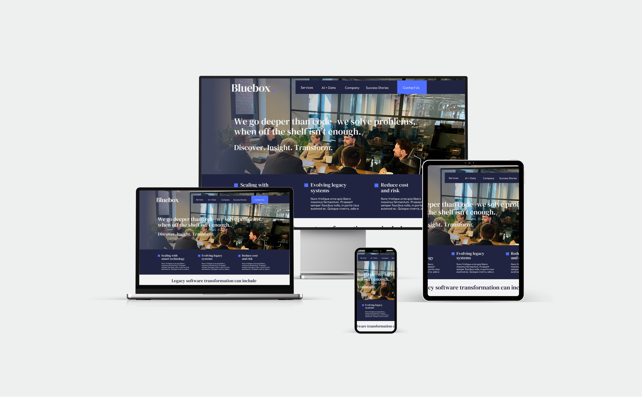
We rolled out the rebrand across all digital and internal touchpoints, ensuring the identity was cohesive, practical and easy for the team to adopt. Importantly, the process helped bring the whole business along on the journey, creating buy-in, excitement and pride as they celebrated their 20th anniversary.
The new identity now supports:
Stronger brand recognition
Clearer communication
A unified visual presence across platforms
A confident platform for future growth
“Sarah has become an extension of our management team and offers great insight and practical input on our marketing activity. Her help with our recent rebrand has been invaluable, cost-effective and well-received by clients. We continue to work with Sarah on all aspects of our marketing, and she keeps us focused and informed on delivery and appropriate channels. I wouldn’t hesitate to recommend Sarah to any management team looking to drive their messaging and activity.”
Bluebox Software Ltd - Simon Chrzanowski - Managing Director
WHATS NEXT
With a strong brand foundation now in place, the focus turns to growth, visibility and momentum.
As Bluebox Software moves beyond its 20-year milestone, we continue to work together to strengthen awareness, communicate value clearly and support ongoing marketing activity - ensuring the brand evolves confidently alongside the business.
This rebrand wasn’t just about celebrating the past - it was about creating a platform for the future.
OUR ROLE
We delivered a full brand transformation, including:
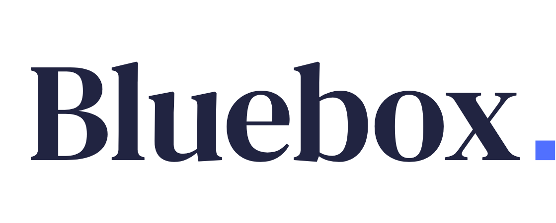
Brand logo & sub-marks
20th anniversary brand mark
Brand guidelines
Typography & colour palette
Website design & content
PowerPoint presentation templates
Ongoing marketing support
Social media management & content
PR & press activity
Corporate Word document templates
Internal communications assets
Digital brand rollout